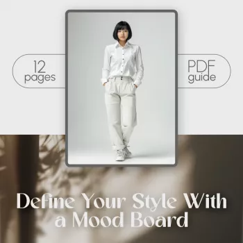
A fashion mood board turns scattered inspiration into a clear style direction. By collecting visual cues—colors, silhouettes, textures, and lifestyle references—patterns emerge that make shopping, styling, and wardrobe editing simpler and more consistent. Instead of chasing random “cute outfits,” you end up with a repeatable look that fits your actual days.
A strong mood board translates “vibes” into tangible style elements you can act on: color families, fits, fabrics, accessories, and even grooming details. It becomes a personal filter—so new pieces work together instead of competing for attention—and it helps separate admiration from alignment (liking an outfit online vs. wanting to wear it weekly).
It also doesn’t require a single aesthetic label. Many people maintain a few boards: one for workwear, one for weekends, and one for events, or boards that shift with seasons. The point isn’t a perfect identity; it’s clarity that reduces friction when getting dressed.
Before saving a single photo, choose one goal: refine everyday outfits, rebuild a capsule wardrobe, upgrade workwear, or define a signature look. A tight focus prevents overwhelm and makes the patterns easier to spot.
If color is a sticking point, a quick refresher on harmony helps when narrowing a palette; Adobe’s overview of color wheel basics is a practical starting point.
The fastest way to build a board that actually works is to start with what already works. Begin with outfits you’ve worn on repeat—screenshots of personal photos are often more revealing than runway images because they reflect your body, comfort needs, and real routine.
Clothing can also influence how you feel and perform day to day, which is another reason to focus on outfits you truly live in. The American Psychological Association summarizes research on how what you wear can affect mindset in its piece on the psychology of clothing.
Editing is where a mood board becomes useful. Aim for 12–25 strong images; fewer images force clearer decisions. Remove duplicates and anything that only works for one body type or one rare occasion—unless it’s a true, intentional goal.
Then group images by theme (silhouettes, palette, footwear, outerwear, accessories) and look for through-lines: recurring necklines, pant rises, hem lengths, layering formulas, and proportion preferences.
| Element | What to Look For | Decision Rule |
|---|---|---|
| Colors | 3–5 core neutrals + 2–4 accent colors | Keep colors that appear in at least 5 images |
| Silhouettes | Volume placement (wide leg, fitted top), length preferences | Keep shapes that feel wearable 3+ days/week |
| Textures | Knit, leather, linen, denim, suede, satin | Prioritize fabrics that suit climate and comfort |
| Details | Buttons, collars, hardware, pleats, seams | Keep details that elevate without fuss |
| Accessories | Jewelry scale, bag structure, shoe toe shape | Keep items that repeat across outfits |
| Overall mood | Words that fit the visuals (e.g., “sleek”, “romantic”, “utilitarian”) | Choose 2–3 words to guide purchases |
Once the patterns are obvious, convert them into decisions you can repeat.
If you’re aiming for fewer, better pieces, a capsule approach pairs naturally with this step. For a helpful framework, see MasterClass on how to build a capsule wardrobe.
Aim for about 12–25 strong images. It’s fine to start bigger, but editing down to the most wearable visuals is what makes the patterns (palette, silhouettes, accessories) clear enough to use while shopping and styling.
Add real-life constraints—weather, dress code, comfort needs—and prioritize personal outfit photos over editorial shots. Keep aspirational looks in a separate “maybe” folder and only move them to the main board when they pass your practicality test.
Yes—use seasonal boards or mini-boards by context (work, weekends, events). Keep a stable anchor like a consistent neutral palette or a few go-to silhouettes, then experiment with accents (color pops, trend accessories, statement shoes) without losing cohesion.


Leave a comment